Diagrams class 4 - create diagrams online
Create diagrams in class 4
Diagrams class 4 - how to create a diagram? on this page we will learn how to create diagrams. We will look at the following types of diagrams:
- Bar charts
- Strip charts
- Image diagrams
- Diagrams with symbols
Diagrams class 4 - only one chapter in the book 'Fit fürs Gymnasium'.

12 MB PDF!
Create diagrams or practice and review all 4th grade topics?
Print 78 pages exercise book for free and practice or practice the individual topics online at Mathefritz. These topics are included in the exercise book:
- Numeracy
- Mental arithmetic problems
- Addition
- Subtraction
- Multiplication
- Division
- Word problems
- Geometry
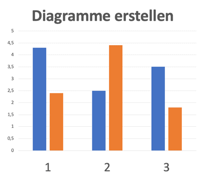
Create diagram online with Plotly
Create diagrams online with Plotly
Plotly is a Javascript / Python library that allows you to create interactive diagrams. With Plotly Studio you can also create diagrams online. Try it out! Here is the link to our diagram on the left:
Create diagrams - task page 43
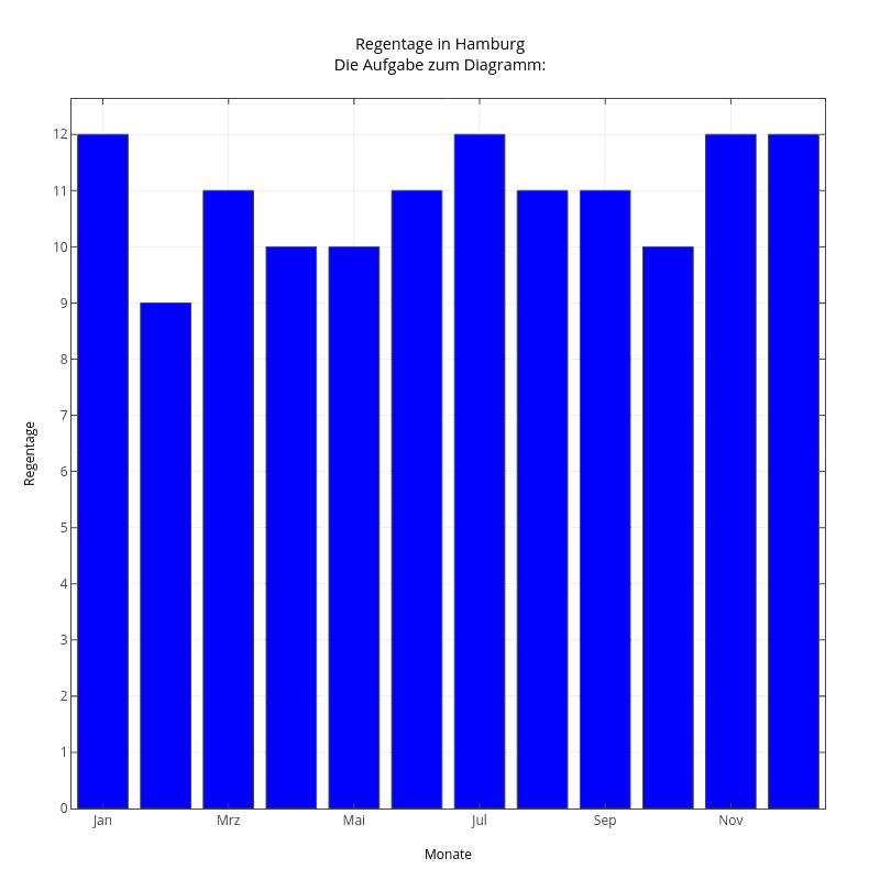
Create diagram with the rainy days in the year
Draw a bar chart or bar graph of rainy days per month for a city of your choice.
Here you can find a table with data.
Notice:
These are only sample values for a specific year. In the coming year it can already look completely different again!
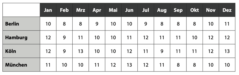
This is how a solution could look like: Create charts online with the data for Hamburg can be found on the Mathefritz page at Plotly.
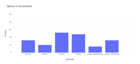
Diagrams class 4 - task page 44 - tree species in Germany
Tree species in Germany
Out of 100 trees in Germany, 16 are beech, 10 are oak, 26 are spruce, 24 are pine, 8 are other conifers, 16 are other deciduous trees. Draw a bar chart for this.
This is what a solution could look like. The diagram with the data for Hamburg.
Create diagram online on the Mathefritz site at Plotly.
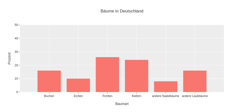
Image diagram - Task page 44 -Inhabitants in Germany
Create diagram as image diagram
In the picture diagram, the population figures of some federal states are shown. A large figure stands for 10 million inhabitants, a small figure for 1 million inhabitants.
Read the number of inhabitants from the picture diagram and fill in the numbers in the boxes.
Tip:
The figures are always rounded to full millions!
First, find out how many inhabitants are represented with the little pictures for each state.
Check your solution with the online exercise.
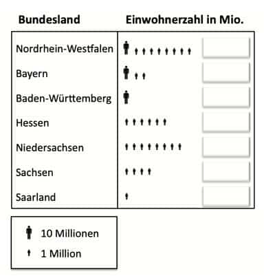
Online exercise on the image diagram.
Drag the correct numbers into the boxes!
In the paper version of the exercise book, you can write the correct numbers with a pen.
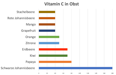
Strip chart - vitamins in fruit - task page 45 in the book
The vitamin C content in fruit - create diagram
In the list you will find fruits with a very high vitamin C content. The data apply to 100 g of a fruit variety. First round the values to the nearest 10 milligrams.
- Black currant: 177 milligrams
- Papaya: 82 milligrams
- Kiwi: 71 milligram
- Strawberry: 65 milligrams
- Lemon: 53 milligrams
- Orange: 50 milligram
- Grapefruit: 44 milligrams
- Mango: 39 milligrams
- Red currant: 36 milligrams
- Gooseberry: 35 milligrams
These are the values rounded to the nearest 10 mg:
| Black currant | 180 |
| Papaya | 80 |
| Kiwi | 70 |
| Strawberry | 70 |
| Lemon | 50 |
| Orange | 50 |
| Grapefruit | 40 |
| Mango | 40 |
| Red currant | 40 |
| Gooseberry | 40 |
This is what your diagram might look like:
Create diagrams online with the tool Plotly-Studio
How to create diagrams online with the Plotly tool?
To create bar charts with the data from a table in Plotly Studio as a chart you can proceed as follows:
Open Plotly Studio(https://plotly.com/create/) in an Internet browser.
Click the "Create" button and select "Bar Chart" from the list of available chart types.
Select the desired option to import your data from a spreadsheet. You can either paste the data directly into the Plotly interface or upload a CSV file.
Check the imported data and make sure that it is interpreted correctly.
Select the appropriate columns of the table for the X and Y axis of the bar chart. You can also select additional columns for further adjustments like groupings or color assignments.
Customize the appearance of the bar chart. You can edit colors, labels, axis labels and other style settings.
Interact with the chart in the preview to make sure it looks the way you want it to.
When you are satisfied with the result, you can export the bar chart or embed the generated Plotly code into your own application.
Plotly Studio is a very comprehensive data visualization tool and offers many more customization options. However, the process above gives you a general overview of the steps to create bar charts with the data from a table.